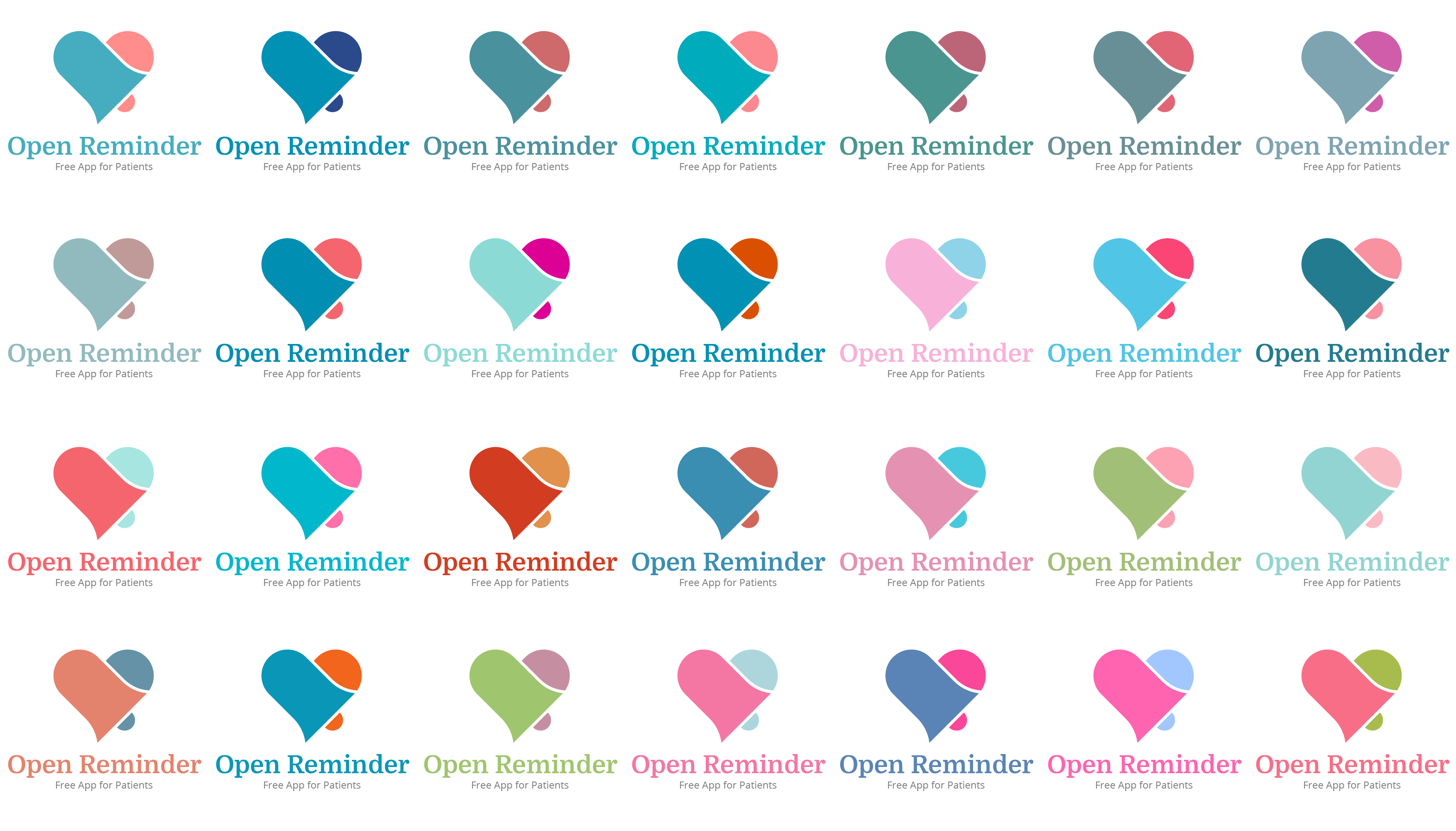
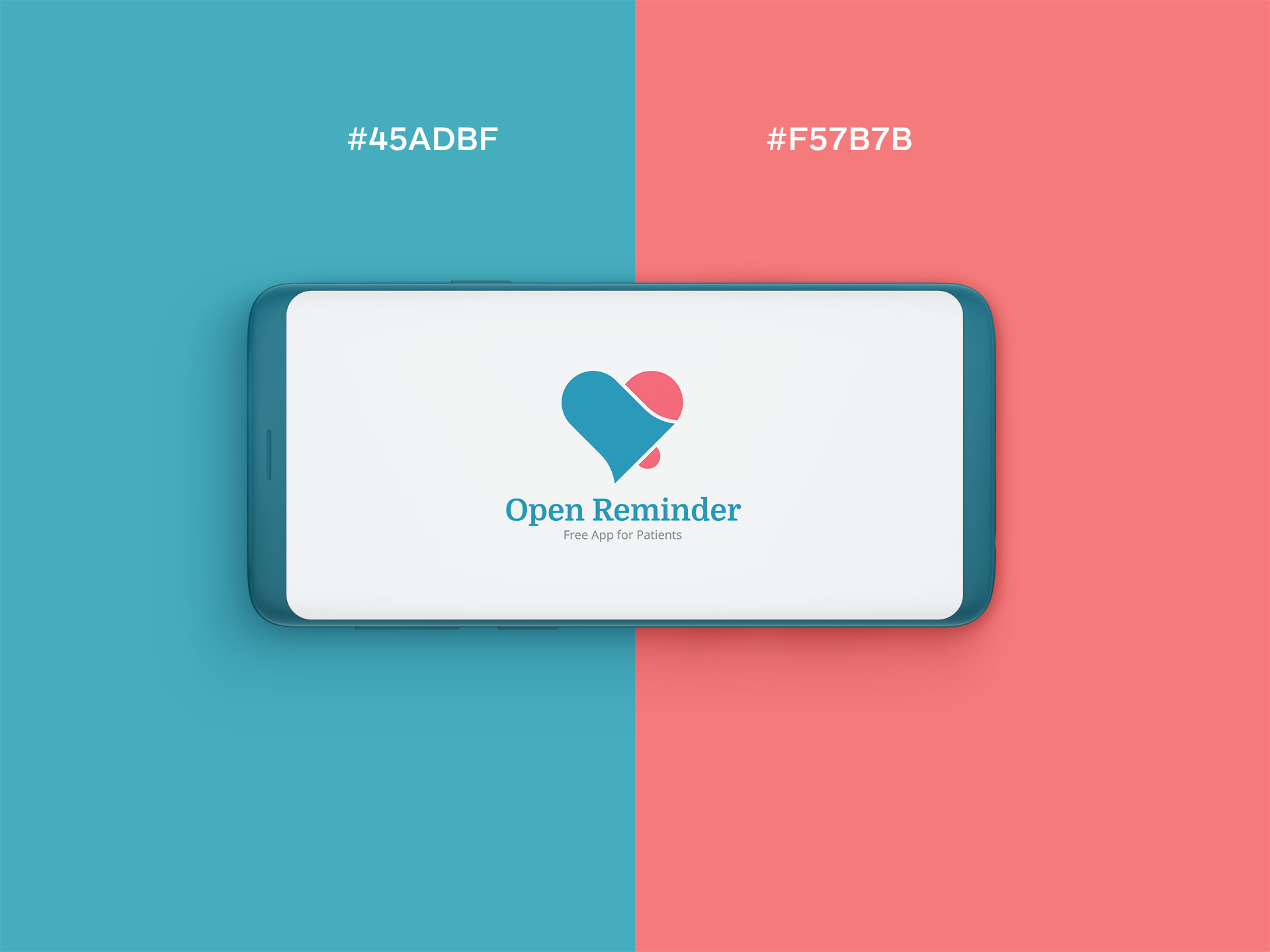
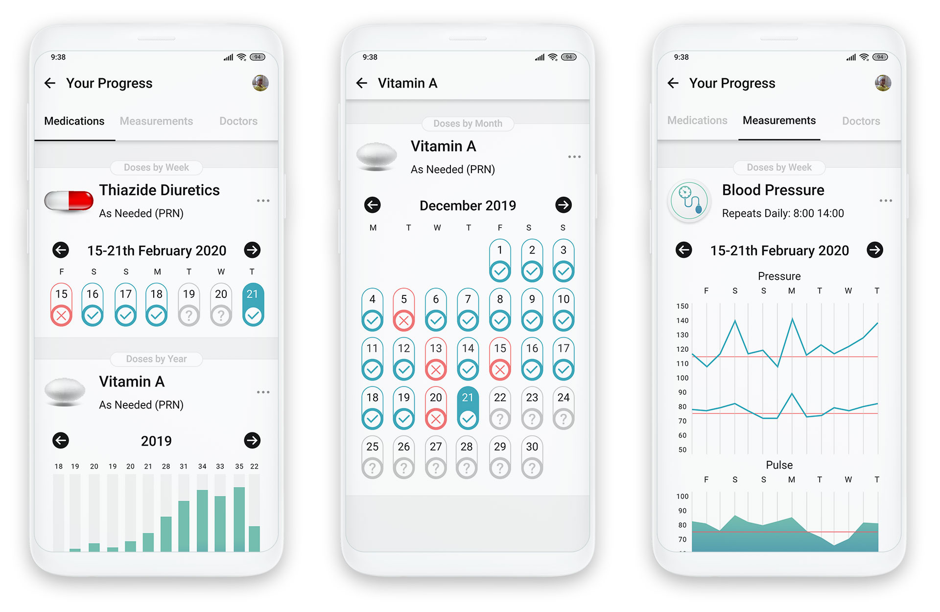
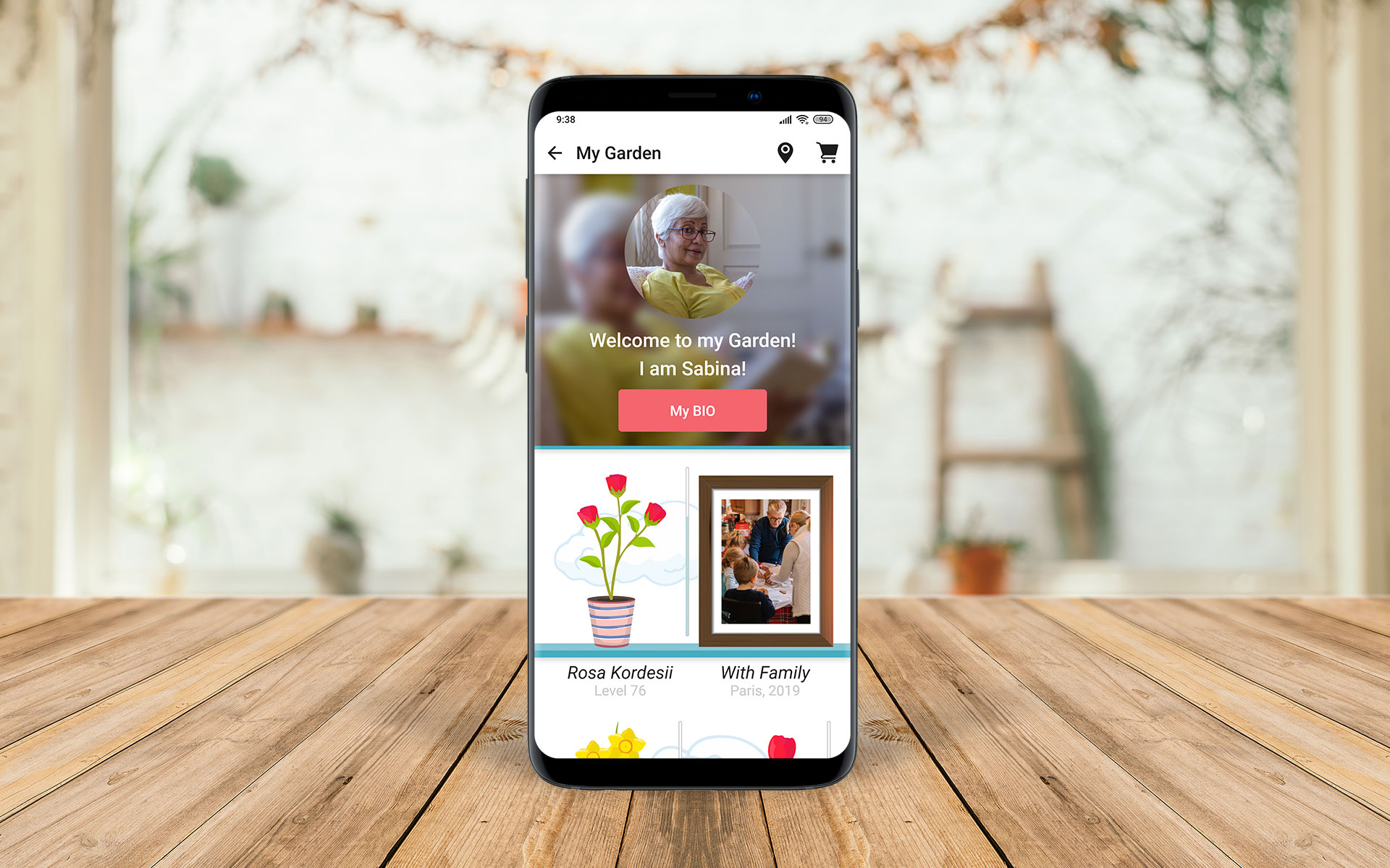
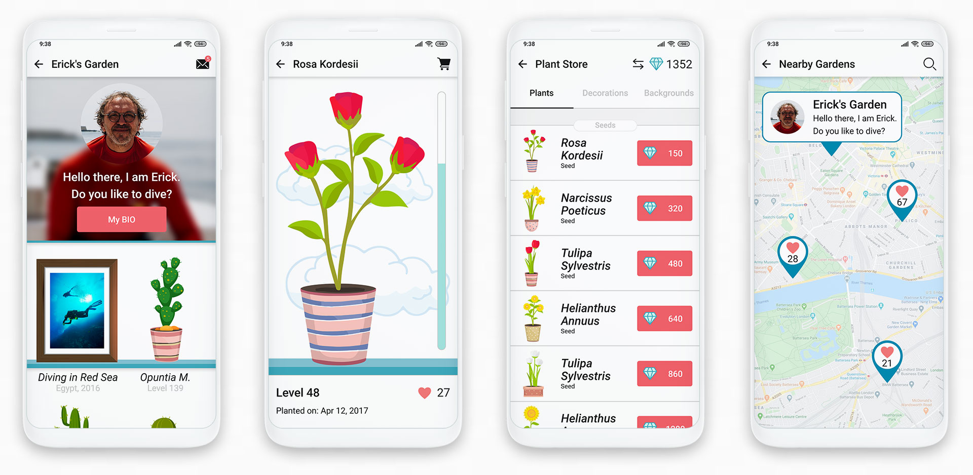
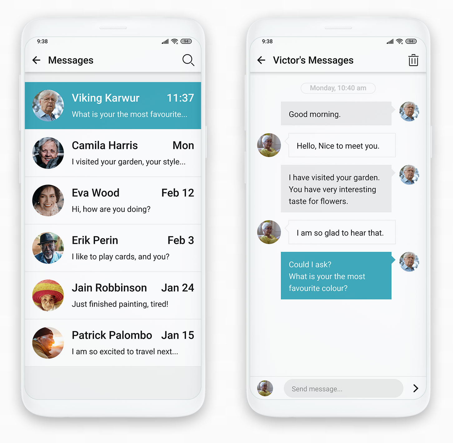
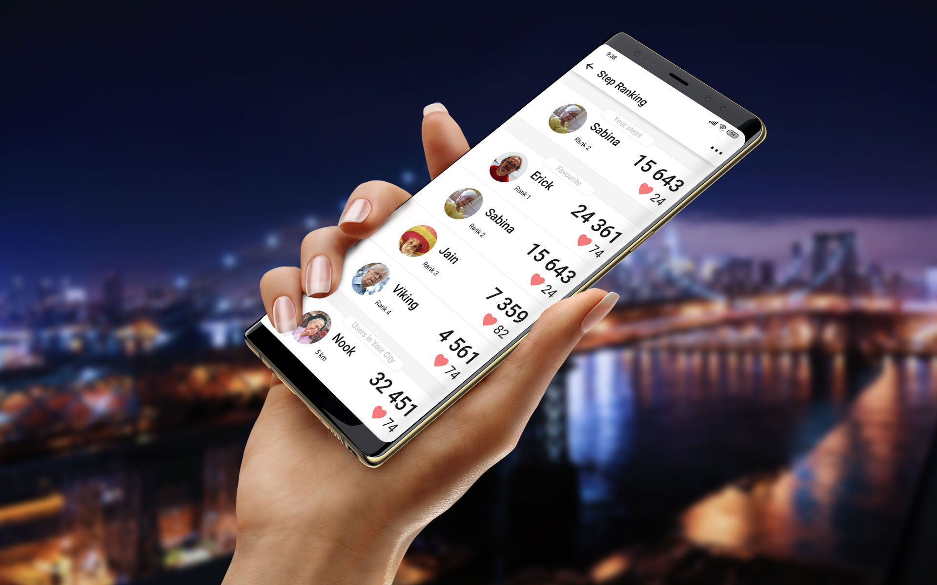
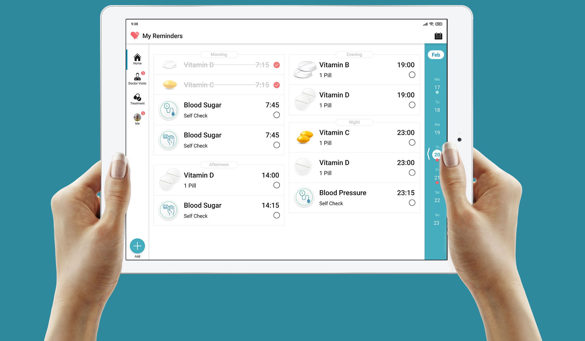
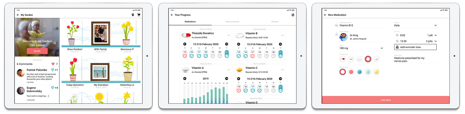
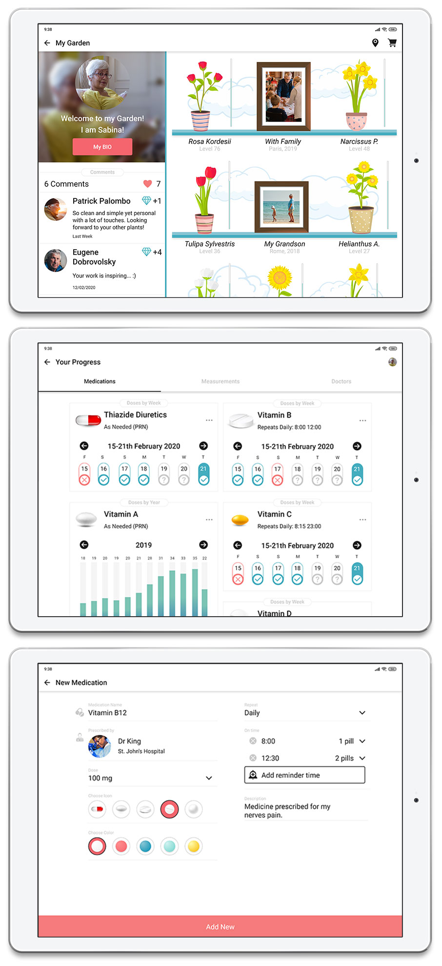
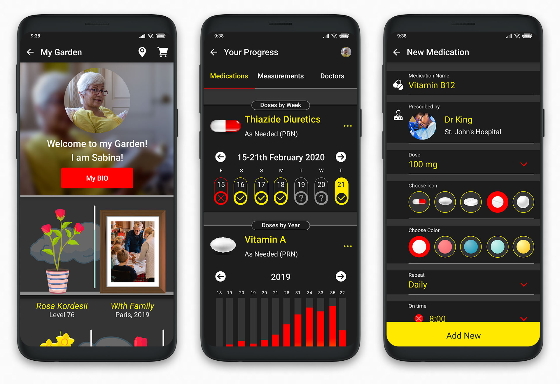
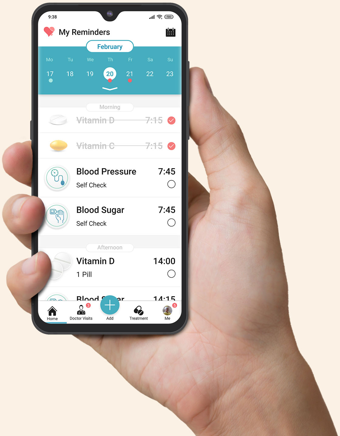
02

Open Reminder

UI Design

Part two of the redesign case-study. The following section presents a new concept of UI, based on the preceding comprehensive UX process and its deliverables.

My Role

UI Design
Presentation

Platform

Android
(Open Source)

Tools

Pen & Paper
Adobe XD

Timeline

Mar 2020

Brand Design

    In the first step, before attempting to create a comprehensive UI Design Concept, I started with creating branding. The logo of Open Reminder represents a heart and a notification bell. The logo uses two main branding colors.

Color Palette

    The Color Palette is a result of a broad study based on Mood Boards and User Research. The majority of users prefer warm red and medical blue as the most suitable colors for the Pill Reminder application.

LogoAll

Variations of the logo based on different Mood Boards.

    The final 2 colors included in palette came in 3 variants each: darker, standard and lighter. The colors presented below are in their standard version.

First Reminder

    After the first run and presenting onboarding messages the application invites users to create New Reminder with a big and easy to spot Call to Action.

Onboarding

    The onboarding screens present visually all the things that are important to the user target group:

The onboarding screens, presenting different values.

Add New Reminder

    During the Interview Sessions, the easy and intuitive process of adding New Reminders was co-designed with the users.

Process of adding a New Reminder in 5 simple steps.

Doctor Visits

    70 percent of users emphasized the need for creating a Personal Health Assistant. Where all the information concerning their health could be stored and managed. It is why Doctor Visits Reminder functionality was created. It is essentially a different function than a Medication Reminder, therefore it occupies a separated screen in the bottom menu bar.

Statistics

    The Personal Health Assistant should also include statistics function to monitor your progress and medication intake.

"Your Progress" screens and extended statistics.

    It is very important for users to be able to monitor how many doses of medicine they took. The users with heart issues amplified a need to monitor Blood Pressure measurements on specific days and times of the day.

My Garden

    It is additional functionality. It was one of the Top Findings that for the target user group Personal Space, Family and Companionship are crucial values. It is why a Personal Garden was created.

Garden Details

    Users could have their own personal space, that they could customize according to their aesthetics and taste. Additionally, users could explore personal gardens created by their neighbors and family members.

Example screens of My Garden functionality.

    Exploration creates a unique opportunity for interaction and a new way to create and maintain friendships with users who have similar values.

Messagning

    When the Personal Graden functionality creates an opportunity for interaction and commenting, no meaningful relationship could be created without direct, personal communication.

The messages list and private message screens.

Steps Counter

    80 percent of the users expressed a need for Personal Health Assistant to promote a healthy lifestyle. It is why Steps Counter functionality was added.

Steps Details

    The users could monitor their healthy lifestyle and compare their achievements with friends and family members.

Activity and healthy lifestyle statistics.

    Additionally, steps gathered by users could be used as a micro currency in Personal Garden. Users could exchange steps for in-garden decorations and plants. Steps could be also donated to friends and family members.

Tablet Mode

    The target user group contains mostly Baby Boomers (55-73). 70 percent of the interviewed users admitted that their senses are not as sharp as before. It is why, when they are at home they prefer to use a tablet device instead of a smartphone.

More Tablet Screens

    Additional screen space provided by the bigger devices, compensates for vision and motoric losses acquired by an aging body. It is why the tablet version of Pill Reminder was thoughtfully designed.

Tables screens in horizontal mode.

    It is also very important for users to provide smooth background synchronization between devices. The majority of users imagined their interaction with the Pill Reminder in a way that they could add and manage their reminders using a tablet when being in a safe, undisturbing environment. The phone should be used to remind users about medications when being outside.


High Contrast Mode

    Visual impairment is a growing issue for users older than 55 years old. 90 percent of interviewed users complained about their senses being worsened than before. The Contrast Mode is an essential function when targeting mature users.

More High Contrast Screens

    The color theme in High Contrast mode was changed from balanced to warm reds and medical blues to vivid yellows and reds. The assumption is that a smooth but not very aesthetically pleasing experience is better than the inability to experience at all.

The High Contrast screens are not as beautiful compared to normal ones, but provide better experience.

    The High Contrast Mode is fully optional, it is why it is only intended to be used by those in need.

Conclusions

Research Helps to Justify Design Decisions

    The design process of the Pill Reminder was predeceased by a long and comprehensive UX Design Process. When I gathered and analyzed a great amount of information. Many insights generated during the first phase were used to justify design decisions while designing UX and UI elements.

What did I learn?
  1. Designing for many different screen sizes and orientations is challenging. User Experience on Smartphones is always slightly different than on Tablets.
  2. It is important to start with simple things and then make the design more complex. I started designing UI by choosing a logo and branding colors. It allowed me to save time and effort in subsequent iterations.
  3. User Testing early and often could save designers and development teams great amounts of limited resources. During the UX Design Phase, I tested my ideas every few days. But during the UI Design Phase, I challenged my design less often. I now know that some redundant work could be avoided if I conducted a few more tests.

What could be improved?
  1. Prototyping Skills: by incorporating different software and techniques to create more realistic prototypes.
  2. Mirco-interactions: by studying new ways of creating those important and often omitted fields of design.


The Next Step

Daily UI Challange

    I am a lifelong learner. It is why in my free time I challenge myself to read books, learn languages and enhance my design skills. The Daily UI challenge provides an externalized, documented results of the self-learning process.

    Thank you for your time, if you have any questions or ideas how could I improve my workflow. Please do not hesitate to contact me, I am always willing to receive constructive feedback.