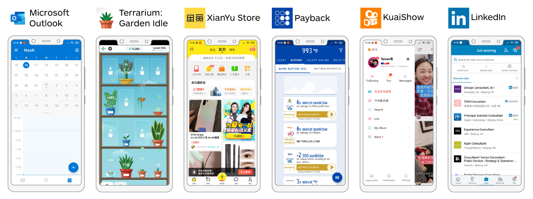
User Research
UX Design
Prototyping
Android
(Open Source)
Pen & Paper
Whiteboard
Cart Sorting
Adobe XD
Jan. 2020
Feb. 2020
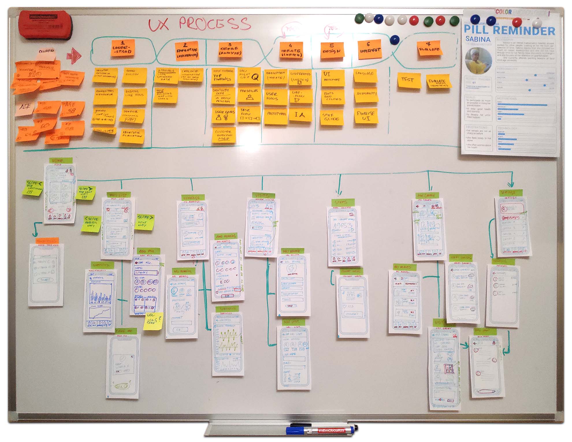
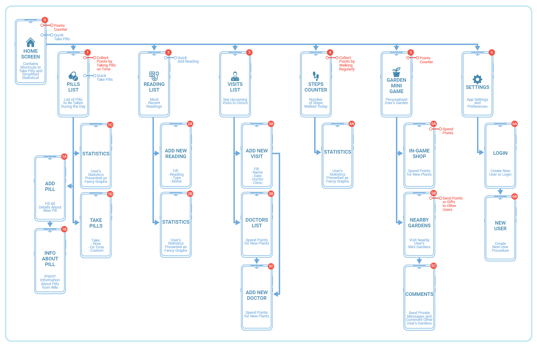
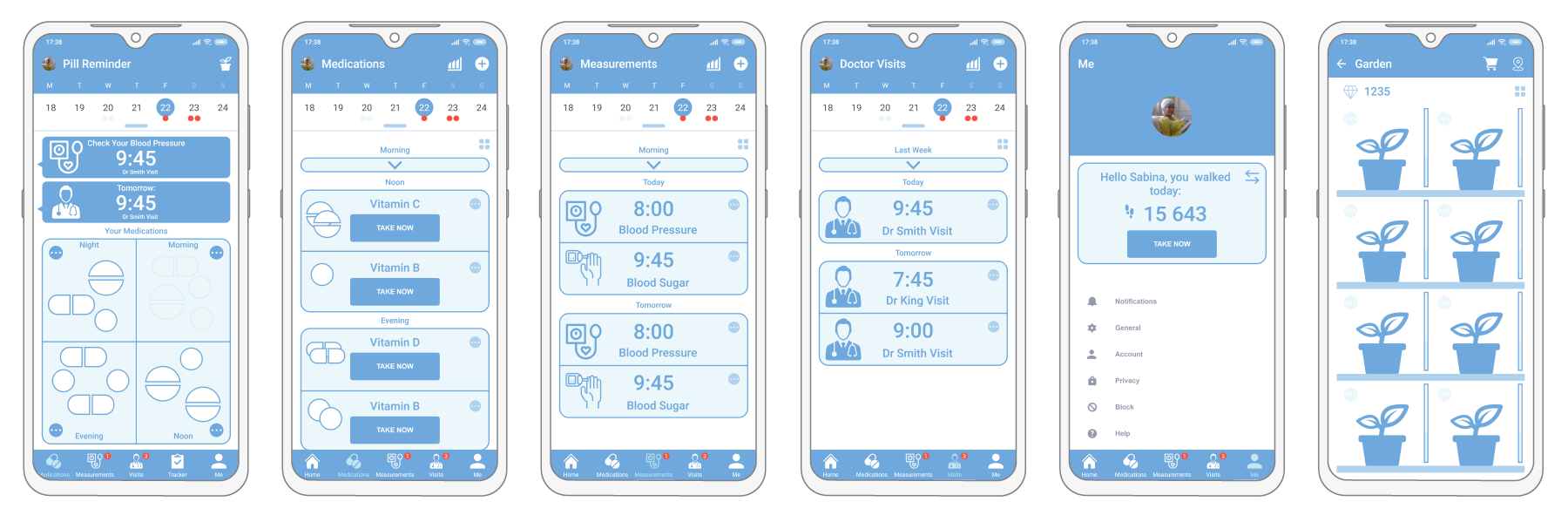
The following case study describes my attempt to create a redesign of an open-source Pill Remainder application for Android called RxDroid. I had chosen an open-source application for very utilitarian reasons. Many people transferring to UX Design from other disciplines decide to try to redesign very popular and successful digital products. Others try to design conceptual applications from scratch, I do not say it is a bad approach. Everone's resources are precious. My humble intention was to learn, gather experience and in the meantime contribute something meaningful to the community.
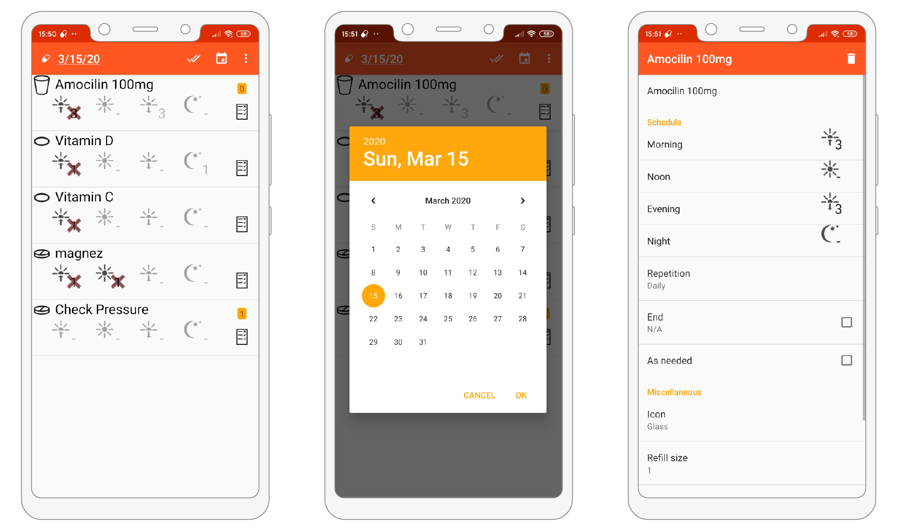
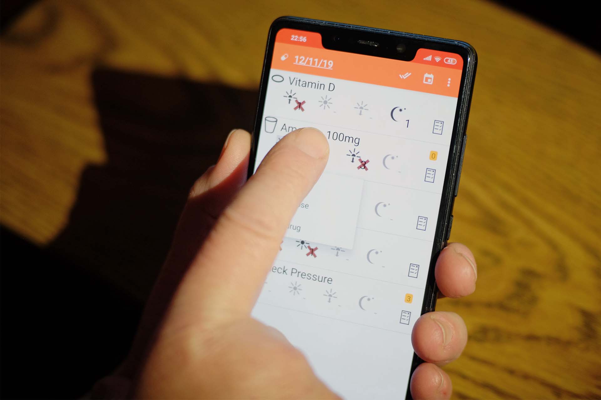
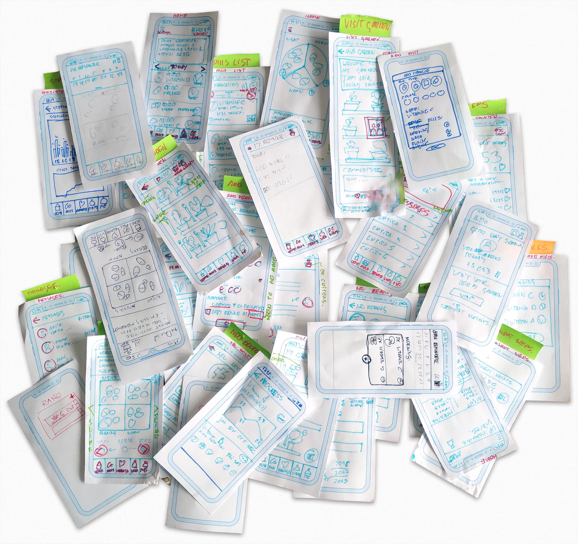
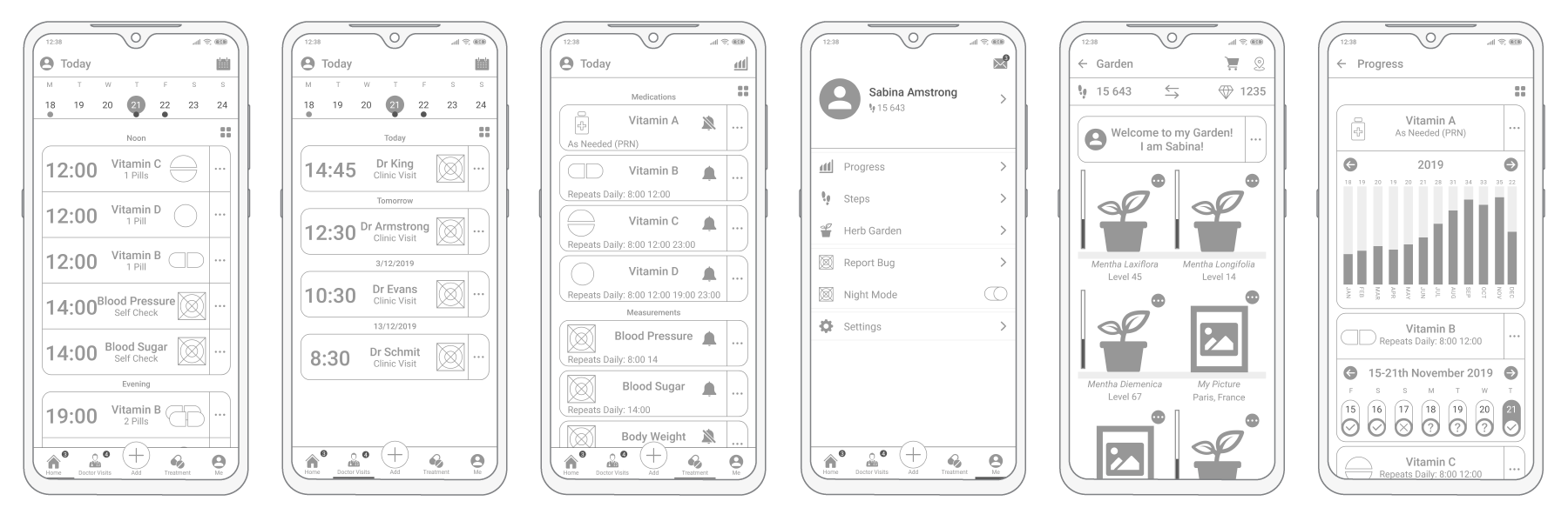
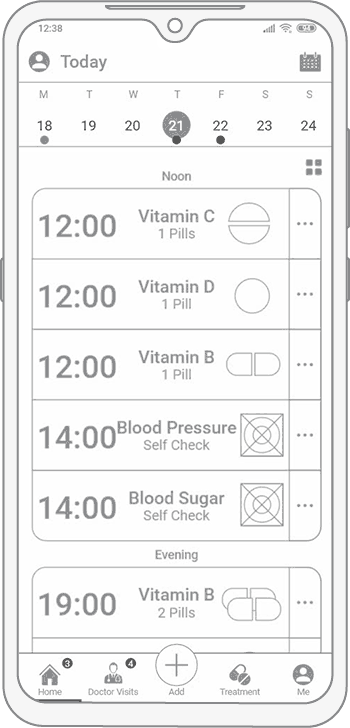
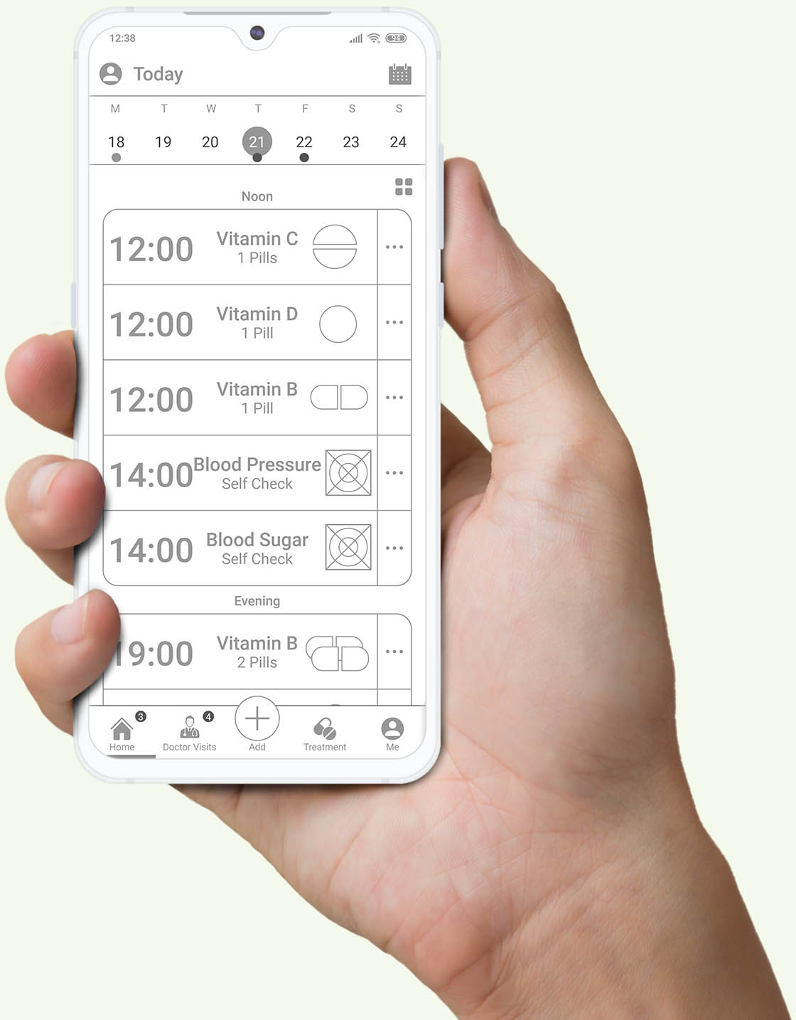
Screenshots of the current version of RxDroid.
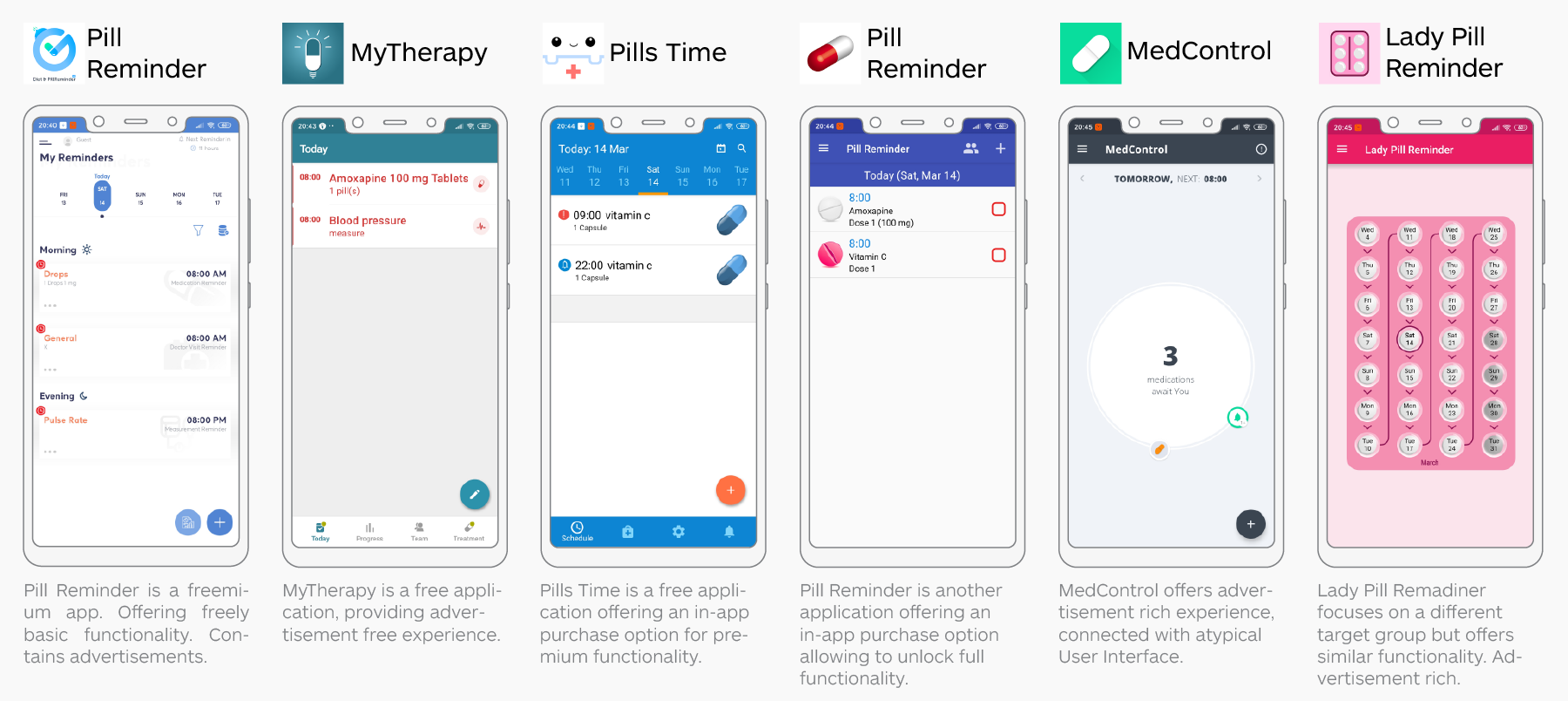
Open-source applications have a long reputation for being very technical, often designed and maintained by geeks for other geeks. It is of course only partially true and there are many great examples of excellent applications for the wider group of users. It is, however true that for some reasons not many open-source applications have the opportunity to incorporate fully-fledged UX processes into their development.
During this study, I followed the Double Diamond process created by Design Council. It has a great number of advantaged allowing to organize design and to prevent the designer from achieving random results. On the other hand, the relationship between diverging and converging phases is agile enough to be easily adjusted to specific design needs. I believe that each design is different, and for each project, slightly different methodologies should be used. The framework, however always stays the same.
The "core" Double Diamond design process.
Below I am presenting a list of methodologies/tools used during the following UX process:
To be frank, a redesign is never really done, it is a continuous effort to keep the digital product relevant. Therefore, what I am presenting below is only one small step in the long, complex process.
From my previous work experience as an Architect, I learned that nothing is truly granted in the design process. They are always different parties having often contradictory requirements.
A simple diagram presenting often contradicting requirements.
It is why since the begining, I assumed that all my assumptions are wrong. I wanted to listen and talk to users, and in the next phases build a possibly unbiased understanding of their real needs.
I started the first diverging phase of design by deconstructing existing design into components. I intended to understand the functionality and existing user flows.
An existing home screen of RxDroid.
I wanted to understand how the application works, so in the next phase, I could conduct simple guerrilla tests with a target group.
Unfortunately, I did not have access to any existing analytics. Therefore I had to begin with research. I based the application's target group demographic on: 2019 Tech Update: Mobile and Social Media Usage, by Generation. I assumed that the Baby Boomers generation - people aged between 55-73 are the most likely to use Pill Reminder application in their daily life.
Target audience technology immersion.
Users younger than 55 years old tend to be in good health, and they very rarely think about the need to remember about medications. While users older than 73 years old, much less likely to own a smartphone or tablet computer.
The next step in the design process was to understand what users felt and how does the original design worked for the target user group. I planned a direct guerrilla testing session in my town.
A 59 years old user playing with interface.
To achieve this, I visited the local 3rd Age University and asked the random group of 10 users to spend five minutes solvingsimple tasks using the existing design. At this stage, I was surprised by how willing people were to participate in testing sessions. The biggest issue I had was not to find new participants but to politely finish the testing sessions.
Results of the guerrilla user testing session.
From the guerrilla testing session, I learned that some tasks were particularly harder compared to other ones. I also asked users a set of open-ended questions to identify Key Problem Areas, that I am going to describe in the following paragraphs.
After the guerrilla testing of the existing design, I had an opportunity to identify key problem areas. They were based on the open questions asked to the users and my understanding of usability heuristics.
Summarised problem areas of the home screen.
I undertake a similar exercise for all of the application's screens. Before attempting to design anything by my self I wanted to understand as much as I could how does the existing design work.
In the next phase, I conducted a competitive analysis. I read reviews and installed a group of selected applications on my phone. Below I am presenting home screens of a few most interesting ones.
Selected competitors with their logos.
From the competitive analysis, I learned that there are generally two types of pill reminder applications. One targeting patients, who need to intake medications regularly. The second group contains women, taking birth control pills.
The most important part of the Discover Phase was user research. It is crucial for every project to learn about and with users. Before a series of interviews at the local 3rd Age University, I prepared a chart containing 9 steps.
An example of a filled user research chart.
I interviewed 10 users aged 59 to 72. Every interview session was recorded, in order to recall information afterward. User Interviews also finished Discover Phase, it was time to converge gathered information.
The Define Phase started with analyzing the information gathered during the interview sessions. I decided to divide insights into 3 mayor categories.
A whiteboard containing part of generated insights.
Each category obtained separated color and described different domains of the user's experience. I also learned that some questions, like asking users to draw ideas for a logo design did not yield any results.
In the next phase, generated insights were grouped into 10 clusters. Each cluster contained similar users' problems or expectations.
A whiteboard during the Insights Clustering phase.
The 10 clustered insights were subsequently organized into the Top Findings. They are 10 really important matters for the users. All of the Top Findings were supported by two user quotations recalled from recorded interviews.
Top Findings with quotations.
For each of the 10 Top Findings, I started to ask "How Might We..." Questions. I wanted to be concrete enough to give a good starting point for future brainstorming, based on these questions.
"HMW..." Questions in relation to the Top Findings.
In the next phase, questions were clustered into 3 Opportunity Areas and 3 Design Principles. Opportunity Areas will be used during a brainstorming session for ideation. While Design Principles, on the contrary, will evaluate results.
Opportunity Areas and their links to Top Findings.
Design Principles and their links to Top Findings.
The final step of the Define Phase was to create a Persona. An imagiary user, who averages all mayor personality traits, goals and frustrations of previously interviewed real users. The key role if the Persona is to keep reminding all of the stakeholders for whom are they building a product. She was printed and handed on the whiteboard.
Sabina the Grandmother - the Persona.
The Develop Phase started with brainstorming. I gathered some of the users who participated in the previous user testing sessions, they were playing the roles of stakeholders. Together we organized 30 minutes long brainstorming meeting to generate as many creative ideas as it was possible. During the brainstorming, we were answering questions based on Opportunity Areas.
Results of the brainstorming session.
The results of the brainstorming were later evaluated by answering HWM Questions based on Design Principles.
I believe that innovation never comes from the competitor analysis, what you can learn from your competitors are the industry standards. It is why I started to explore products beyond my domain, other digital products solving similar problems in a different context.
Examples of other digital products solving related problems.
In the next phase, I began to sketch on paper. Sketching with a pen is the most effective way of transferring muddled ideas in the brain to become a reality. This the most primitive designing tool has a great advantage, it is so natural for humans to use the pen, that there is almost nothing to limit our creativity.
Some of the UI sketches created during Pen & Paper sessions.
It is why, I sketched screens, UI elements, user flows, screen flows creating a bunch of ideas. As a next step, I evaluated sketched ideas, to create a holistic concept of the user experience.
After generating a lot of ideas during brainstorming and sketching sessions I decided to provide a "Value versus Effort" evaluation. I empathized with Persona: Sabina the Grandmother, and tried to understand which functionalities would be the most important for her.
Some of the UI sketches created during Pen & Paper sessions.
In the next step, I opposed the value of functionalities to how feasible building each of them would be. This action created a clear diagram, which functionalities should be prioritized.
Simuntinausly to sketching, I was developing User Flows. I based my ideas on answers to "HWM" Questions, prepared during brainstorming. I was empathizing with situations that users could find themself in Trying to understand what they could want and need to achieve.
User Flow: Add a new medication to the list.
User Flow: Add a new doctor visit.
User Flows helped me to understand the holistic idea of the application I was designing. It was a very important intermediate step before creating Screen Flows.
Screen Flows are a crucial step before building wireframes and interactive prototypes. They are easy to produce and change, they allow the designer to iterate quickly. They are also very easy to be understood and review by a variety of stakeholders.
Conceptual Screen Flows on the whiteboard.
I started creating Screen Flows using conceptual sketches produced in the previous phase using Pen & Paper. I was sticking them on the whiteboard and trying to find a relationship that could provide a good user experience. During the process, I shared my concepts with users that I had the opportunity to interview before. I used their opinions as stakeholders' reviews.
A digitalized iteration of the Screen Flows.
The final version of Screen Flows was digitalized, for easy reviews and sharing. At that time I was confident to use colors and shades to make them more visually pleasing. I was about to learn in the next step, that making things visually pleasing is not always the best idea to recieve unbiased feedback.
After the long research phase, brainstorming and clustering ideas creating wireframes is a step that I believe every designer waits for. It is a rewarding culmination of the process. It is why I started generating early wireframes with great enthusiasm.
Too polished wireframes, looking almost like finished UI.
The bitter lesson was about to come very soon. I began to arrange micro-interviews with users, I intended to review my ideas early and iterate quickly. After the first 5 interviews, I did not receive any useful feedback. My users were fixating about colors, icons, fonts, and the profile picture. No one could focus and talk about functions and features. I quickly understood that my wireframes were too polished, too color-rich.
I am not calling this section "Finished Wireframes", for a simple reason: designing digital products is never a finished process. Even when the product is ready for release there are always opportunities for improvement. Failure is definitely one of them. I learned that wireframes should RAW, colorless, technically the rawer the better. It is why I updated my concept and get back to the users.
Updated RAW wireframes.
This time micro-interviews went differently. Users somehow felt that what I was presenting to them was only a prototype. They did not hasitate to criticise and give their own ideas. We could talk about functionality and features. I geathered great amount of useful information, and updated wireframes one more time.
Simuntionusly to wireframes I was developing an interactive prototype. Adobe XD has a great feature allowing to design screens and to prototype seamlessly. Every even the smallest change in the design could be very quickly reviewed in deeper context of interaction between screens.
Simple interactions between screens.
I was designing more screens, and more relationships, sometimes micro-testing with target user group at 3rd Age University. At this stage, I did a lot of micro-testinng with just 2-3 tests every few days. Then review test results, iterate and prepare an updated version of the wireframes.
Prototyping window in Adobe XD.
When I felt the prototype was mature enought, I decided to arrange bigger moderated testing session to evaluate my these.
To test the matured prototype, I contacted the group of 10 users. I meet before during guerrilla testing of the original design. To benchmark my design I gave them the same tasks, like before. Because the functionality of the application was extended, I also designed a few new tasks.
* Take all meditations functionality was removed.
After comparing results of both testing sessions I was able to benchmark my design and with confidence finish this iteration of the UX Design Process.
The design process technically never finishes. There are always new tools to be used, new technologies constantly emerge, patterns change. Therefore UX Designers should constantly learn and broaden their knowledge. Learning is never finished process as well.
The best design presented poorly will never attract attention. It is very important to present digital products properly, with colorful high-quality images. In the second part of this article, I am attempting to sell my concept.
Thank you for your time, if you have any questions or ideas how could I improve my UX Process. Please do not hesitate to contact me, I am always willing to receive constructive feedback.